


Why Brand Identity Design Is More Than Just a Logo for a business
We all heard it before: “Your brand is more than just a logo”, I actually say it a lot! We heard it so much, that it’s getting annoying, but it is true! and with start-ups popping up everyday, it matters more than ever.
If your business is ready to grow, chances are that you already know this. So, this is not a lecture, but a confirmation that the path you are on (investing in your brand identity) is the right one!
Think about your favorite brands, clothing, make-up, drinks, food, electronics… Everytime you interact with them, you are not just looking at their logo, you are experiencing an emotion. Maybe it’s the color palette they use, the imagery, the tone on their emails, maybe is the way the website guides you, or the packaging when it arrives at your doorstep. That’s the power a brand identity design has, it’s the language your business speaks without saying a word, it’s the emotional connection with their clients.
From Visuals to Experience, Brand Identity System
So brand identity creates a system of elements that work together to represent your business. That system of brand elements include visual assets (like your logo set, fonts, color uses, photo style), but they also include the intangible elements (like the tone of voice, brand personality, customer experience, emotional connection, core brand values).
Not convinced? Picture this, the logo is the cover of a playlist; the fonts, colors and message are the songs in it. You got attracted to the playlist because of the logo, but what it make you stay or leave was the everything else. Together, those elements created a emotional connection with you!
So, a established or defined brand identity it doesn’t just look good, it stands out, it tells to your clients “We understand your needs in our services/products”, “we know where we’re going” (basically we have it together), “We are worth your trust”, so they stay and listen to your music! That’s when it can be the difference between your industry, you become the option.
How Visuals Meet Strategy to Shape Perception
Some believe that branding is just the visuals, but it’s not just the visuals is the strategy that those same visuals are designed with. The colors you use, you shouldn’t pick them because they look pretty; you should chose them because they evoke the trust, excitement or innovation, because they evoke the emotion your brand voice, values, mission aligns with it. Just like typography, it’s not just a font, it’s a voice for your brand; don’t use it just because is pretty and you like it, use it because it follows your strategy and is readable!
For Example of Brand approach per industry:
Healthcare brands
often use calming blues, greens, and soft neutrals paired with approachable sans-serif fonts. This creates a sense of trust, care, and wellness; reassuring patients and clients that they’re in safe hands.
Corporate services (like consulting firms, law firms or accounting practices)
Lean into clean layouts, deep blues, grays, or muted palettes, often paired with serif fonts. This communicates stability, professionalism, and reliability.
Government organizations
Typically balance authority with accessibility; strong emblematic logos, bold yet neutral color palettes (navy, burgundy, or forest green), and clear typography to reflect structure, credibility, and inclusivity.
Restaurants
Highlight flavor and atmosphere through design; vibrant earthy tones for rustic dining, sleek monochromes for modern eateries, or playful bright colors for casual cafés. Typography often mirrors the dining style (e.g., script fonts for fine dining vs. bold sans-serif for fast casual).
Energy and mining companies
Gravitate toward grounded, robust visuals; earthy tones like copper, steel gray, or deep green, paired with strong geometric typography. These elements reflect resilience, strength, and a connection to the land.
Nonprofits
Often use warm, inviting colors (like teal, orange, or soft green) and human-centered imagery to highlight their mission. Typography tends to be approachable and clear, making their message easy to digest and emotionally resonant.
Entertainment brands
Use bold, dynamic visuals; high-contrast palettes, playful typography, and imagery that sparks excitement. The goal is to capture energy, creativity, and fun.
Hospitality (hotels, resorts, travel services)
Often rely on elegant serif fonts and calming palettes (like sandy beige, aqua, or sunset tones). This conveys relaxation, luxury, and memorable experiences.
Pet-related businesses
Lean toward warm, approachable design; soft pastels or bright playful colors, rounded typography, and friendly iconography that instantly connect with pet lovers.
Travel-tourism brands
play with vibrant, aspirational palettes inspired by landscapes; turquoise oceans, golden sunsets, earthy mountains, with adventurous, clean typography to spark curiosity and excitement for exploration.
Why it matters to you?
As a business owner you know your audience is smart; they make a judgement about your credibility in seconds. A strong designed brand identity ensures that those judgments are positive ones, and not a negative ones.
The Client Experience, Bringing It All Together
Wherever is that your clients finds you, social media, website, search, business card, flyers, ads, referrals, etc, every single one of those places are a opportunity for you to reinforce your brand identity. Why it matters? because familiarity builds trust. When your potential clients sees a brand experience cohesive, they feel confident in investing in your services.
Stop thinking that your logo is your brand identity.
It’s not the continent it’s part of it. the visuals you use, the voice and message you use, the emotion that evokes, all of it is your Brand Identity. Your audience expects it, so they keep coming back as you deliver it!
Key Takeaways on a defined Brand Identity will bring trust
When someone starts to recognise your brand, that creates trust, a trsut that will convert into a sale. And at the end of the day, that’s what a business is, when is not a non-profit.
A business final goal is to increase their income, the income that will support the continuation of the purpose of your mission’s business. Your brand is what busts your connections with your audiences! Get your brand together!!! (or your s#%t together).
- Brand identity is more than visuals; it’s strategy plus experience.
- Consistency across all touchpoints builds trust and recognition.
- Strategic design helps your audience make faster, more favorable decisions.
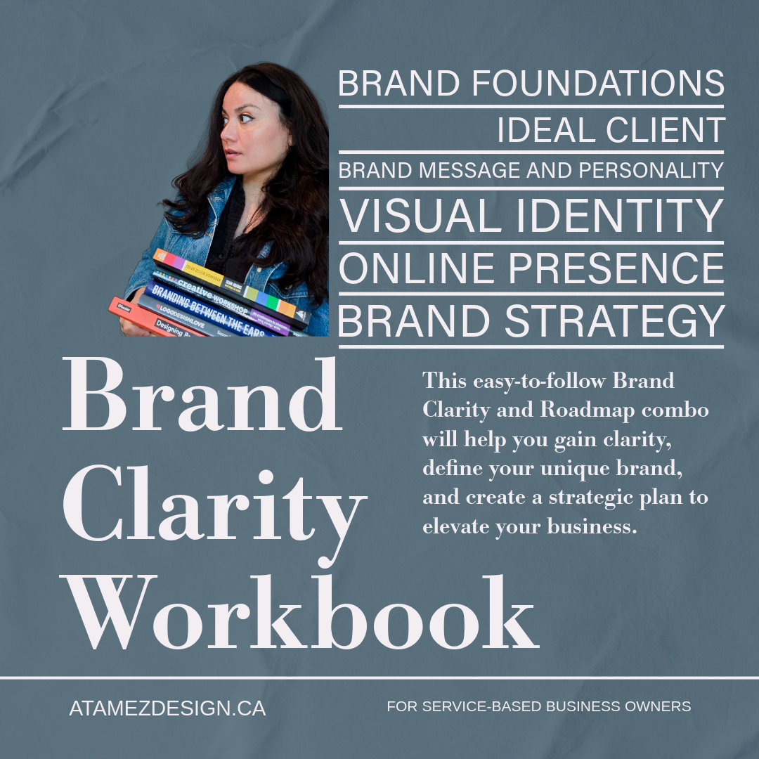
Ready to Clarify Your Brand Before You Design?
Brand Clarity Workbook for Service Providers
This is the same process I use to create successful brands for my clients, now simplified for you to do at your own pace.
Ana Tamez
If you want to make sure your brand identity is more than just beautiful visuals, start with a strong foundation. My Brand Clarity & Strategy Roadmap Bundle is designed for business owners who are ready to elevate their branding but want to ensure they’re moving with clarity and purpose.
Define your business foundation by investing in your business while on a limited budget. You and your business deserve the right opportunity to grow!
Get instant access to the Brand Clarity & Strategy Roadmap Bundle here.
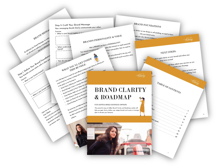
For just $99, you’ll get:
- A guided workbook to define your ideal audience and messaging.
- A strategic roadmap to align your visuals with your business goals.
- Actionable insights you can use whether you’re DIY-ing or working with a designer.
- 35 pages for you to define your business foundation!


